
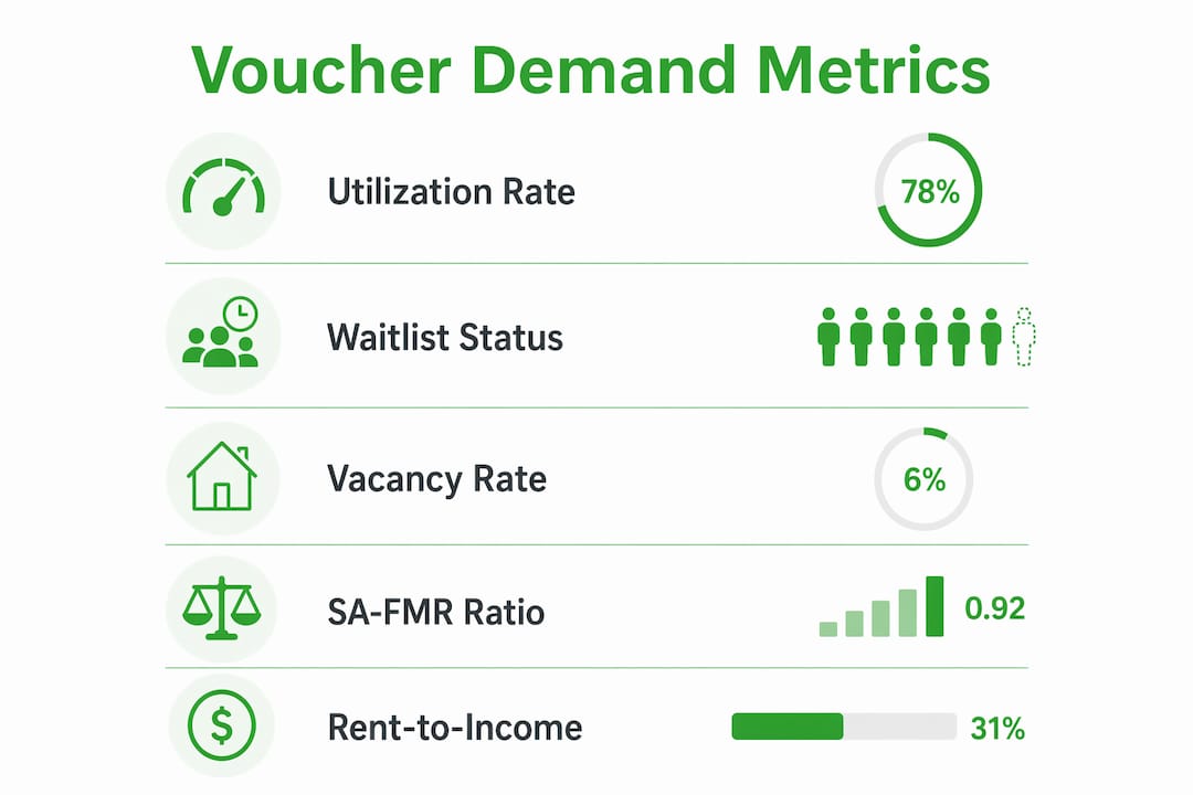
The strongest signals for identifying high demand voucher locations are voucher utilization rate above a high threshold, a closed or multi-year PHA waitlist, low rental vacancy, a Small Area Fair Market Rent (SA-FMR) exceeding the metro FMR, and a rent-to-income ratio indicating unmet need. Pull those five numbers before you look at anything else.
Your first-screen checklist:
- HCV utilization: Leased assisted units divided by authorized units. Pull from the HUD HCV Data Dashboard. Flag any PHA running above 95% or showing year-over-year growth.
- PHA waitlist status: Check the local PHA's website for open/closed status and application volume. When Hialeah opened its waitlist, it drew 51,000 applicants for roughly 1,000 vouchers. A closed list is not a dead end; it signals persistent latent demand.
- Rental vacancy rate: HUD flags ZIP codes with vacancy below 4% as areas where vouchers are difficult to use. Below 4% is your filter threshold.
- SA-FMR signal: If a ZIP's SA-FMR tops 110% of the county or metro FMR, HUD's own mapping tools flag it as a high-cost zone, which typically means higher payment standards.
- Rent-to-income gap: Divide average listing rent by median voucher-holder income for the tract. A ratio above 1.25 indicates unmet need.
Pro Tip: Run this five-point screen on a spreadsheet before you visit a single property. Geographies that clear all five filters are rare. When you find one, move fast.
Table of Contents
- Where does authoritative voucher data actually live?
- What measurable thresholds actually define high voucher demand?
- How to run the full data pull and score your shortlist
- How to read mixed or misleading signals
- What research from Terner, HUD, and Deal-zilla shows about voucher demand
- Key Takeaways
- The signals investors keep misreading
- Deal-zilla cuts the shortlist process from weeks to days
- Primary sources and further reading
Where does authoritative voucher data actually live?
Every signal above has a primary source. Knowing which dataset answers which question saves hours of dead-end searching.

| Signal | Primary Source | What to Extract |
|---|---|---|
| Voucher utilization / leasing | HUD HCV Data Dashboard | Leased units, authorized units, utilization % by PHA |
| Voucher-difficulty areas | HUD User HCV Map | Low Poverty, Low Vacancy, High SA-FMR overlays |
| Payment standard benchmarks | SA-FMR tables (HUD User) | ZIP-level SA-FMR vs. metro FMR ratio |
| Household income / poverty | U.S. Census / ACS (Table B19013, B17001) | Tract-level median income, poverty rate, household composition |
| Market rents / vacancy trends | Zillow Observed Rent Index (ZORI), CoStar, local MLS | Current asking rents, vacancy rate by ZIP |
| Waitlist status / preferences | Local PHA website | Open/closed status, preference categories, application counts |
HUD HCV Data Dashboard is your utilization anchor. It publishes PHA-level leasing data so you can see exactly how many vouchers are in use versus authorized. A PHA at 97% utilization with a closed waitlist is a very different market than one at 80% with an open list.
SA-FMR tables tell you the payment ceiling by ZIP. High SA-FMRs relative to the metro average mean HUD has already acknowledged that rents in that ZIP are elevated, which translates directly to higher payment standards for landlords. You can download the current SA-FMR table from HUD User and sort by the ratio column in about ten minutes.
ACS data (American Community Survey, 5-year estimates) fills in the demographic picture. Pull Table B17001 for poverty rates and B11001 for household type. A tract with a high share of families with children is a forward-looking signal for multi-bedroom demand, since many counties show at least 66% of voucher households include children.
Local PHA pages are underused. Beyond waitlist status, they publish preference categories (homeless, elderly, local residency), which tell you who gets vouchers first and what unit sizes they need. Some PHAs also run mobility programs that actively steer voucher holders toward specific neighborhoods, a forward-looking demand signal covered in Section 6.
For market rent validation, ZORI gives you a monthly time series by ZIP. Cross-check ZORI against your SA-FMR to see whether market rents are running above or below the payment standard. When market rents exceed the payment standard, voucher holders struggle to lease. When they sit just below, landlords can price competitively and still fill units quickly.
What measurable thresholds actually define high voucher demand?
"High demand" is not a feeling. It is a combination of metrics, each with a defensible threshold, that together indicate a market where voucher holders want units and cannot easily find them.
Voucher utilization rate is the cleanest single metric. Divide leased assisted units by authorized units. Above 95% means the PHA is running near capacity; voucher holders are actively searching and landlords who accept vouchers face real competition for their units. A year-over-year increase from 90% to 95% is often a stronger signal than a static 97%, because it shows momentum.
PHA waitlist signals require interpretation. An open waitlist with a short queue suggests manageable demand. A closed waitlist, or one that opened briefly and collected thousands of applications, signals persistent latent demand. That latent demand matters to investors because it represents households who will lease the moment they receive a voucher. Closed lists are not a reason to avoid a market; they are often the strongest indicator of a top voucher hotspot.
Statistic to watch: HUD defines "areas where vouchers are difficult to use" using criteria including census tracts with lower poverty rates, ZIP rental vacancy rates below a certain threshold, or ZIP SA-FMRs above the metropolitan area FMR. These thresholds come directly from 24 CFR § 983.3(b) and drive eligibility for higher payment caps.
Rental vacancy thresholds follow HUD's own definition. Below 4% is the regulatory floor for flagging tight markets. In practice, investors should treat anything below 5% as a signal worth investigating and below 3% as a near-certain indicator of sustained demand.
SA-FMR signals work differently than most investors expect. A ZIP with an SA-FMR above 110% of the metro FMR is not necessarily expensive in absolute terms. It means HUD has calibrated the payment standard upward for that ZIP, which gives landlords more room to price at or near market rate while still accepting vouchers. That is the investor opportunity.
Rent-to-income gap is the tiebreaker. Divide the average asking rent in a ZIP by the median income of voucher-holding households in that tract (from ACS). The Terner Center's county-level analysis found ratios as high as 1.6 in counties like Lafayette County, MS, and approximately 1.5 in Miami-Dade. A ratio above 1.25 flags meaningful unmet need. Above 1.5, demand is severe.
Pro Tip: Never rely on a single metric. A 97% utilization rate in a market with a 10% vacancy rate is far less compelling than 90% utilization paired with 3% vacancy and a closed waitlist. The combination is the signal.
How to run the full data pull and score your shortlist
This workflow takes roughly 2–4 business days to produce a scored shortlist, and another 1–2 weeks for field validation.
Step 1: Pull the data
- Download PHA-level leasing and utilization data from the HUD HCV Data Dashboard. Filter to your target state(s).
- Open the HUD User HCV Map and enable the Low Poverty, Low Rental Vacancy, and High SA-FMR overlays. Export or screenshot the flagged ZIPs and tracts.
- Download the current SA-FMR table from HUD User. Add a column: SA-FMR divided by metro FMR. Flag anything above 1.10.
- Pull ACS 5-year estimates for your target ZIPs: Table B19013 (median household income), B17001 (poverty), B11001 (household type). Use Census.gov or the Census API.
- Pull ZORI or local MLS data for current asking rents and vacancy by ZIP.
Step 2: Apply quick filters
Reduce your universe before scoring. Keep only geographies that meet at least one condition from each column:
- Demand column: Closed or multi-year waitlist OR utilization above 95%
- Tightness column: Vacancy below 4% OR SA-FMR above 110% of metro FMR
Geographies that clear both columns move to scoring. Everything else drops.
Step 3: Score and rank
Apply weights to produce a composite score for each remaining geography.
| Indicator | Weight | How to Score |
|---|---|---|
| Voucher utilization rate | — | 10 = above 97%; 7 = 95–97%; 4 = 90–95% |
| PHA waitlist status | — | 10 = closed, multi-year; 6 = open, long queue; 2 = open, short queue |
| Rental vacancy rate | — | 10 = below 3%; 7 = 3–4%; 4 = 4–5% |
| SA-FMR vs. metro FMR | 15% | 10 = above 110%; 7 = 105–110%; 3 = below 105% |
| Rent-to-income gap | 10% | 10 = above 1.5; 7 = 1.25–1.5; 3 = below 1.25 |
Multiply each raw score by its weight, sum the results, and rank geographies from highest to lowest. Your top 10–15 become the shortlist.
Pro Tip: Re-run scores quarterly. SA-FMR tables update annually, PHA waitlist status changes without notice, and vacancy data shifts with the rental cycle. A market that scored 7.2 in Q1 may score 8.5 by Q3 after a waitlist closure.
Step 4: Validate in the field
For each shortlisted geography:
- Check live listings on Zillow, Apartments.com, or local MLS. Confirm asking rents are within 5–10% of the SA-FMR payment standard.
- Call or email the local PHA. A short outreach template: "I own [or am acquiring] rental units at [address/ZIP]. I'd like to understand your current payment standards, inspection timeline, and whether you have voucher holders actively searching in this area." Most PHAs respond within a week.
- Confirm inspection standards. Some PHAs run stricter inspections than HUD's Housing Quality Standards baseline. Ask specifically about typical turnaround time and common failure points.
- Check whether the PHA runs a mobility or opportunity-area program, which signals sustained demand in specific neighborhoods.
For investors thinking about property eligibility for mortgage alongside voucher tenancy, confirming unit type and condition requirements early prevents surprises at closing.
How to read mixed or misleading signals
A high score on paper does not guarantee quick leasing. Several field conditions can undercut even the best-looking data.
Latent vs. active demand is the most common source of confusion. A closed waitlist means households want vouchers, not that they currently hold them and are searching. Active demand comes from voucher holders who have a voucher in hand and are within their search window. Both matter, but differently. Latent demand tells you the market will absorb units over time. Active demand tells you how fast you'll lease today. Check with the PHA whether they have current voucher holders searching in your target ZIP.
Rent reasonableness and inspection risk can block uptake even in genuinely tight markets. If a PHA's payment standard sits below the SA-FMR (some PHAs set standards below the maximum), your asking rent may exceed what the voucher covers. Understanding how rent reasonableness works before you acquire a property prevents the scenario where you own a unit in a high-demand area but cannot get it approved.
Common pitfalls to avoid:
- Relying on city-level aggregates. A city may show moderate overall utilization while specific tracts run at 98%. Always drill to the ZIP or tract level.
- Misreading SA-FMR without checking the local payment standard. The SA-FMR is a ceiling, not a guarantee. The PHA sets the actual payment standard, which can be lower.
- Ignoring unit-size demand. Families with children make up the majority of voucher households in many counties. A portfolio of studios in a family-heavy market will underperform regardless of how tight the overall vacancy rate looks.
Under 24 CFR § 983.3(b), HUD's definition of "areas where vouchers are difficult to use" is the regulatory basis for increased payment caps. Understanding that definition tells you exactly which geographic conditions trigger higher payment standards, and why some areas that look expensive on the surface are actually better for investors than they appear.
What research from Terner, HUD, and Deal-zilla shows about voucher demand
The Terner Center's county-level data makes one point clearly: voucher stress is not a coastal phenomenon. Lower-cost states contain counties with rent-to-income ratios above 1.5, meaning voucher holders in those markets face the same affordability crunch as households in Miami-Dade or Los Angeles. Investors who limit their search to high-cost metros miss a large share of the opportunity.
PHA mobility programs are a forward-looking signal most investors overlook entirely. When a PHA actively counsels voucher holders to move into specific neighborhoods and provides financial incentives to do so, demand in those neighborhoods tends to be durable. Philadelphia's Housing Opportunity Program is a documented example: it provides counseling and incentives that increase moves into selected neighborhoods. Checking whether your target PHA runs a similar program takes ten minutes on their website and can tell you where demand is being actively directed.
"Investors frequently misread voucher counts as demand. The stronger predictor of quick leasing is market tightness — vacancy rate and rent-to-income gap — combined with PHA rules on payment standards and inspections." — NAHRO
The Urban Institute's analysis reinforces this: in tight rental markets, voucher holders struggle to find units even when many hold vouchers, because low vacancy and rising rents limit their options. High voucher counts in a loose market are not the same as high demand. The combination of tightness and voucher volume is what creates investor opportunity.
Deal-zilla's approach combines HUD HCV exports with SA-FMR data and a PHA outreach step to produce a scored shortlist faster than manual research. The Section 8 Investment Analyzer and Deal Analyzer tools are built around the same weighting logic described in Step 3 above.
Pro Tip: When you find a county where the Terner Center data shows a high rent-to-income ratio and the HUD map flags multiple ZIPs as High SA-FMR, you have a convergence of signals that public data rarely produces. That convergence is worth acting on quickly.
Key Takeaways
Identifying high-demand voucher areas requires combining five measurable signals — utilization, waitlist status, vacancy, SA-FMR ratio, and rent-to-income gap — then validating with live listings and direct PHA contact.
| Point | Details |
|---|---|
| Five-signal screen first | Check utilization, waitlist status, vacancy, SA-FMR ratio, and rent-to-income gap before any other research. |
| HUD maps flag the best ZIPs | The HUD User HCV Map overlays Low Vacancy, Low Poverty, and High SA-FMR zones that directly correspond to higher payment standards. |
| Closed waitlists signal opportunity | A closed PHA waitlist indicates persistent latent demand, not a dead market — it gives landlords leverage. |
| Unit size matters as much as location | Many counties show at least 66% of voucher households with children; multi-bedroom units in those markets lease faster. |
| Deal-zilla speeds the shortlist | Deal-zilla's Section 8 Investment Analyzer and Deal Analyzer apply this scoring logic to produce a contact-ready shortlist in days. |
The signals investors keep misreading
Most investors who target voucher markets make the same mistake: they count vouchers instead of measuring tightness. A city with 8,000 active vouchers and a 9% vacancy rate is a buyer's market for tenants. A city with 3,000 vouchers and a 2.8% vacancy rate is where landlords hold the leverage. The absolute number of vouchers is almost irrelevant without the vacancy context.
The second misunderstanding is treating inspection friction as a reason to avoid a market rather than as a competitive moat. Landlords who prepare units to pass HUD Housing Quality Standards before listing face less competition, not more. Most investors who complain about inspection delays never called the PHA before acquiring the property to ask about typical turnaround times and common failure points. That one phone call changes the entire calculus.
Unit size fit is the third blind spot. Families with children make up the majority of voucher households in many counties, and they need two- and three-bedroom units. An investor who buys studios in a family-heavy market will underperform regardless of how strong the utilization data looks. Check the ACS household composition data for your target tract before you decide on unit type.
The practical shift is straightforward: lead with market tightness signals, build a relationship with the local PHA before you need it, and prepare units to pass inspection before you list. Investors who do those three things consistently outperform those who rely on voucher counts alone.
Deal-zilla cuts the shortlist process from weeks to days
Running the five-signal screen manually across dozens of ZIPs takes time. Deal-zilla's Section 8 Investment Analyzer is built specifically for this workflow: it connects to HUD HCV and SA-FMR data, applies the scoring weights described above, and produces a ranked shortlist with PHA contact information already populated.

The Deal Analyzer and Rent Analyzer tools let you move from shortlist to deal-level underwriting without switching platforms. You can validate asking rents against SA-FMR payment standards, run a BRRR or fix-and-flip scenario, and confirm rent reasonableness, all in one place. For investors targeting family-sized units in high-demand counties, the low-risk rental investment strategy guides built into the platform help you size the deal correctly from the start.
Start your first shortlist at deal-zilla.com. Upload your target state or metro, apply the five-signal filters, and have a scored, contact-ready geography list within a business day.
Primary sources and further reading
Bookmark these resources and use them in the order the workflow demands.
- HUD HCV Data Dashboard — PHA-level utilization and leasing data. Start here for voucher utilization rates.
- HUD User HCV Map — Overlays for Low Poverty, Low Vacancy, and High SA-FMR zones. Use to flag ZIPs and tracts that qualify for higher payment standards.
- SA-FMR Tables (HUD User) — Annual ZIP-level SA-FMR figures. Download and sort by SA-FMR-to-metro-FMR ratio to find high-payment-standard ZIPs.
- U.S. Census / American Community Survey — Tables B19013, B17001, B11001 for income, poverty, and household composition at the tract or ZIP level.
- Zillow Observed Rent Index (ZORI) — Monthly asking rent time series by ZIP. Use to validate market rents against SA-FMR payment standards and track vacancy trends.
- Terner Center County Reports — County-level breakdowns of who holds vouchers, rent-to-income ratios, and household composition. Use to identify counties with severe voucher stress outside coastal metros.
- Urban Institute Housing Voucher Analysis — Research on market tightness, landlord behavior, and voucher mobility. Use to interpret why high voucher counts don't automatically signal investible demand.
- NAHRO Payment Standards Guidance — Policy context on how payment standard changes shift market opportunity.
- Local PHA websites — Waitlist status, preference categories, payment standards, and mobility program details. Check these after the HUD data pull to confirm field conditions.
| Source | Best For |
|---|---|
| HUD HCV Dashboard | Utilization rate, leasing data by PHA |
| HUD User HCV Map | Voucher-difficulty overlays, SA-FMR flags |
| SA-FMR Tables | Payment standard benchmarks by ZIP |
| ACS (Census) | Income, poverty, household composition by tract |
| ZORI / MLS | Market rent validation, vacancy trends |
| Terner Center | Rent-to-income ratios, household demographics by county |
This article is general information for educational purposes. Confirm current HUD rules, payment standards, and PHA-specific requirements with the relevant PHA or a qualified housing professional before making investment decisions.